You can spend thousands driving vehicles to your lot, but if your pay station doesn’t guide customers toward the right decision, you’re leaving memberships behind.
Most car washes focus on traffic.
The best operators focus on conversion.
You can spend thousands driving vehicles to your lot — but if your pay station doesn’t guide customers toward the right decision, you’re leaving memberships behind.
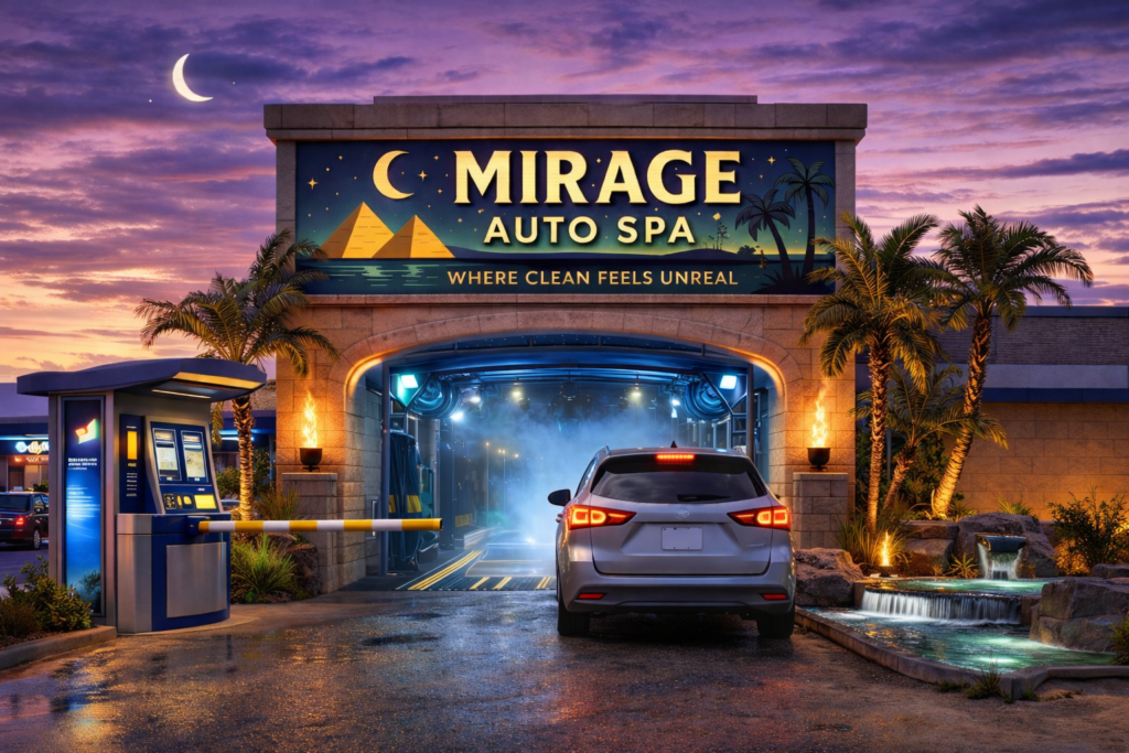
Your pay station is not just a payment device.
It’s your most important salesperson.
The First 5 Seconds Matter
When a customer pulls up, they should immediately understand:
• What the best wash is
• Why unlimited is the smarter option
• What action to take next
If your screen feels cluttered, confusing, or overly technical, customers default to the cheapest option.
Clarity increases upgrades.
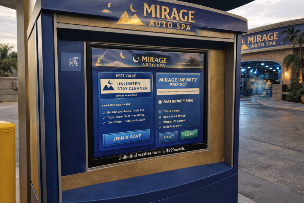
Highlight One “Smart Choice”
High-performing car washes don’t present five equal options.
They visually anchor one package as the smart choice.
This can be done through:
- A “Best Value” badge
- Stronger color contrast
- Slightly larger design hierarchy
- Clear savings messaging
When everything looks equal, customers hesitate.
When one option is positioned correctly, customers follow it.
Reduce On-Screen Text
Operators often try to explain everything:
Ceramic protection.
Graphene coating.
Triple foam.
Spot-free rinse.
Undercarriage blast.
The customer does not need a technical breakdown.
They need:
Protection.
Shine.
Convenience.
Simplify the messaging. Sell the outcome.
Design For Readability In Sunlight
Many pay station screens look fine indoors…
…but wash out in direct sunlight.
Use:
- High contrast colors
- Bold typography
- Clear spacing
- Large buttons
If customers struggle to read the screen, they rush the decision.
Rushed decisions rarely favor premium upgrades.
Align Your On-Site Branding
Your pay station screen should match:
- Your website
- Your signage
- Your vacuum bay messaging
- Your promotional materials
When branding shifts at each touchpoint, trust decreases.
Consistency builds confidence.
Confidence increases upgrades.
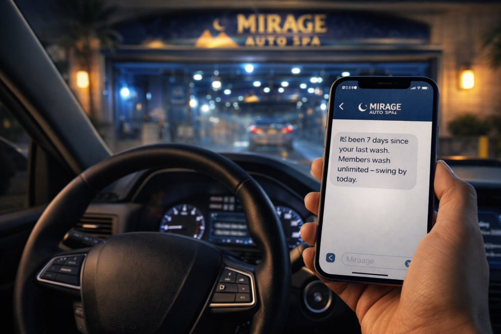
Make Unlimited The Easy Yes
Unlimited memberships should feel like the obvious decision.
Strong pay station strategy includes:
- Monthly price comparison vs single wash
- Clear savings messaging
- Visual emphasis
- Simple enrollment process
If joining takes too many steps, customers skip it.
Remove friction.
The Bottom Line
Car washes don’t struggle with traffic.
They struggle with conversion.
Your pay station is the most valuable real estate on your lot.
Design it intentionally.
Simplify the message.
Highlight the smart choice.
Make unlimited feel obvious.
If your pay station looks outdated, cluttered, or inconsistent with your brand, you’re not maximizing your growth.
Marketing doesn’t stop online.
It happens at the gate.